
Table of Contents
Every event marketer has walked into a stunning room and thought back to the registration page that got them there, which looked nothing like it. Our CEO, Sam Eitzen, doesn't soften it: "So much of event design is really bad, honestly." The venue usually isn't the problem. Everything around it is, and attendees judge that long before they reach the door. That's why event design matters more than the room suggests.
We build the part of an event guests put their hands on, the activation, on our experiential marketing platform, so we see where the seams show. Sam explains it in the video below.
Key takeaways
- Attendees read your event's design from the registration page on, not from the venue.
- Design is the first evidence of whether the people running the event know what they're doing.
- A great room can hide weak design everywhere else, and guests notice the mismatch.
- Walk the whole journey as a guest, activation included, before the day.
Why does event design matter?
Because it's the first evidence attendees have of whether you know what you're doing, and they read it before they arrive. Good design, Sam says, "lets people know how serious you are about what you're doing."
That impression forms fast. When researchers at the University of Basel and Google flashed screenshots of real websites at people, how busy and how typical each page looked shaped how appealing it seemed within 50 milliseconds, and still did at 17 (Tuch et al., 2012). Nobody reads an agenda in 50 milliseconds.
The event site, the registration page and the confirmation email come first, and each one is design whether or not anyone briefed it that way. (Getting people through that page is its own job; see how to increase event attendance.)
What does bad event design cost a brand?
Credibility, and you lose it before anyone has seen your content. When Stanford's Persuasive Technology Lab asked 2,684 people to judge the credibility of live websites, the look of the site came up more than anything else, ahead of what the sites said.
46.1%
of the comments people wrote while judging a website's credibility mentioned its design look. Source: Fogg et al., "How Do People Evaluate a Web Site's Credibility?", Stanford Persuasive Technology Lab and Consumer WebWatch, 2002.
Events get judged the same way. In Sam's words, good design "just communicates you can take me seriously. We know what we're doing." Without it, an attendee discounts the event before it starts, along with the sponsors, the speakers and the activation. Nobody fills in a survey about it. They just expect less.
Why does the room look great when nothing else matches?
Because the venue does the work in person, and nothing does that work anywhere else. "It's really easy in person to make something look beautiful if you have the right venue," Sam says. Then comes the question every event-goer recognizes: "Have you ever been to an event where the venue and kind of what you experienced in person does not match at all any of the marketing that was done for the event? I think this happens way too frequently and it needs to be fixed."
Here's what's easy to miss: the mismatch is rarely one bad asset. The site, the emails, the signage and the activation come from different people on different timelines. Each looks fine alone, and nobody owns how they look side by side. IMEX made Design Matters its industry talking point for 2026 and 2027, with a CEO line that fits: "Design isn't decoration."
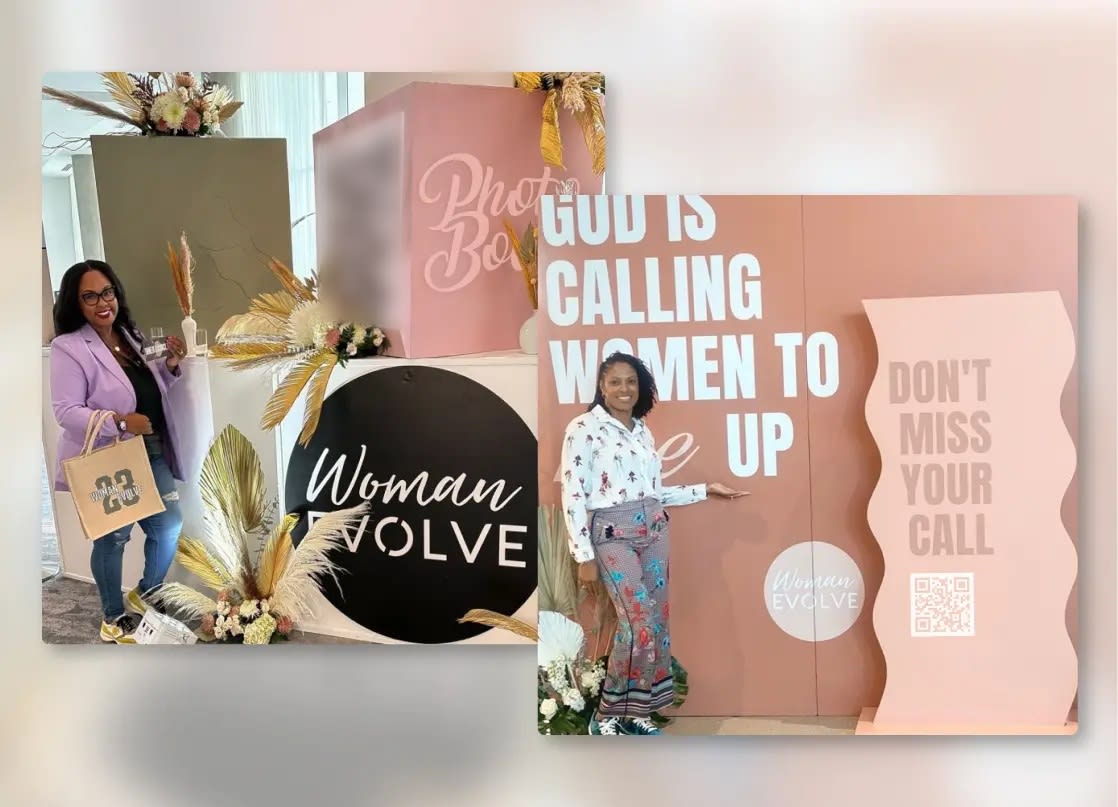
If the trouble is guests walking past your activation, that's placement and incentive, not design; why event activations fail covers it.
Which touchpoints carry your event branding?
All of them, in the order a guest meets them. Sam's list for our own work runs "from the website to the experiences to the micro sites that users interact with to the output photos." For an event, that looks like this:
- The event site and registration page
- Every email before the day, from confirmation to the last reminder
- Signage, wayfinding and the stand or kiosk around the activation
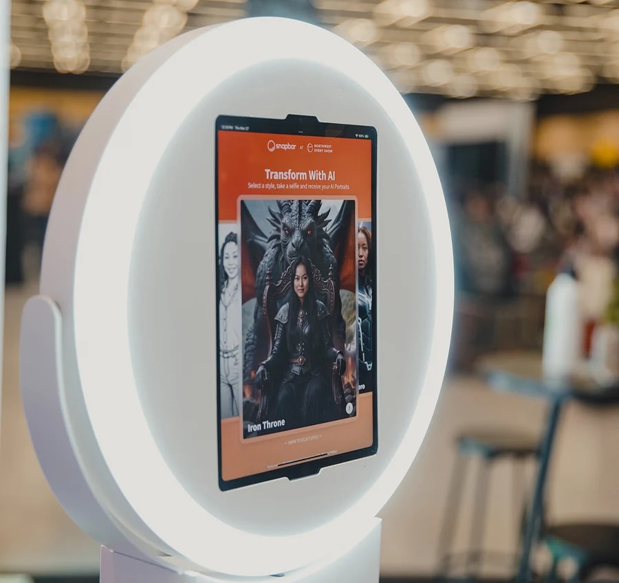
- The activation's own screens
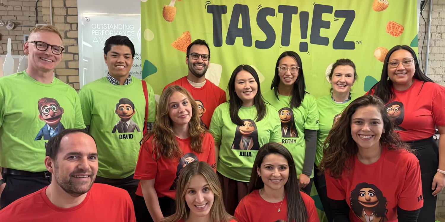
- The content guests take home, plus the message that delivers it and the gallery they share it from
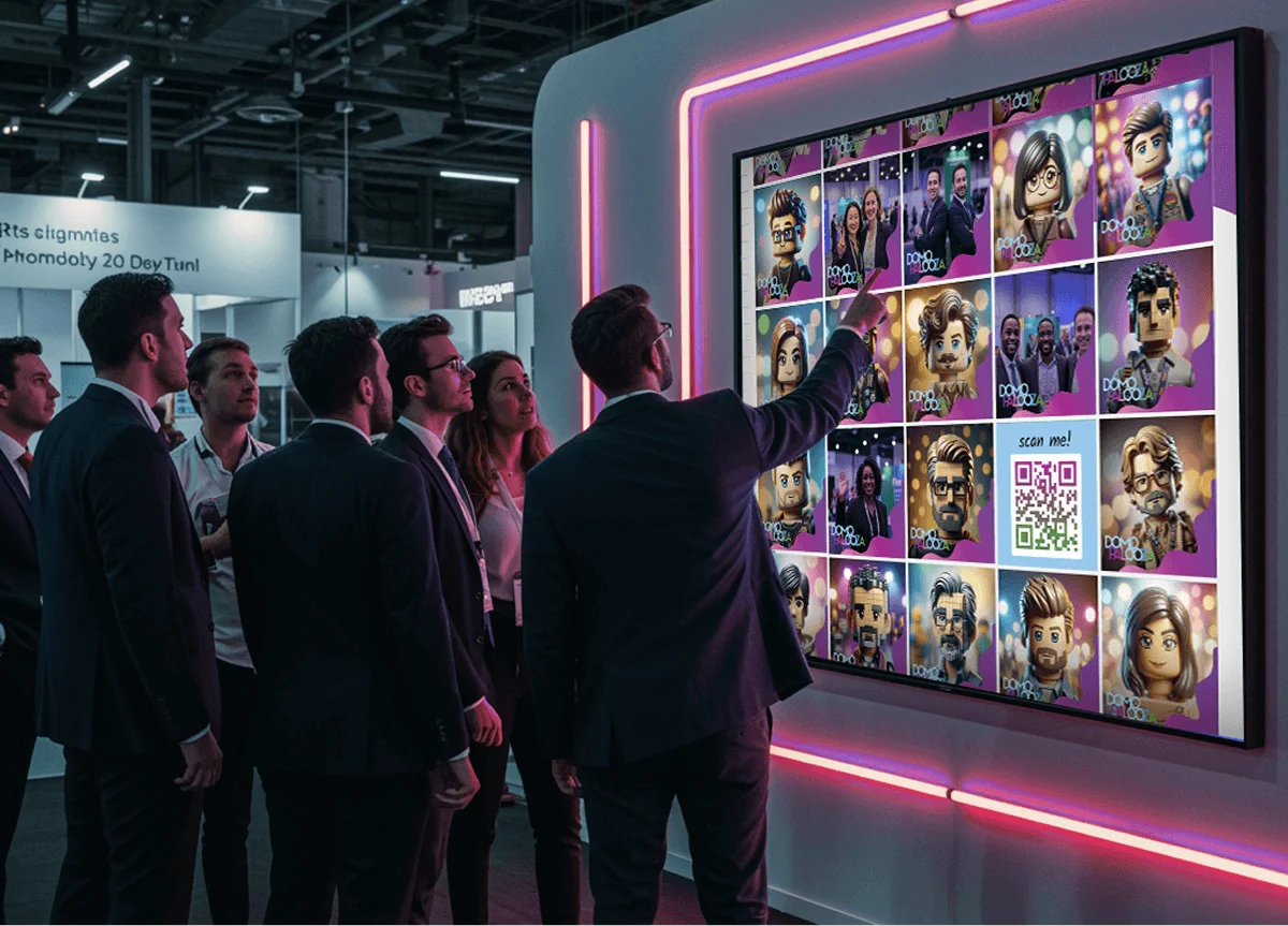
- The live displays the whole room can see
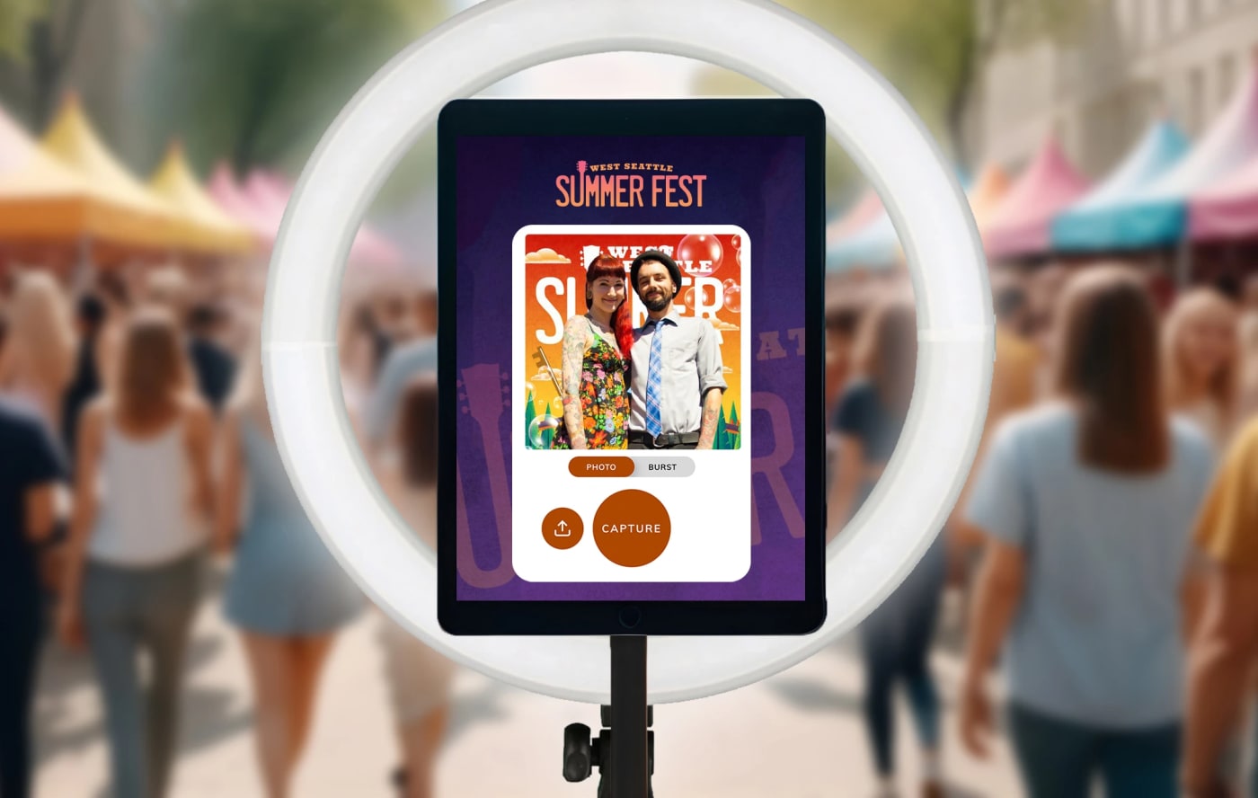
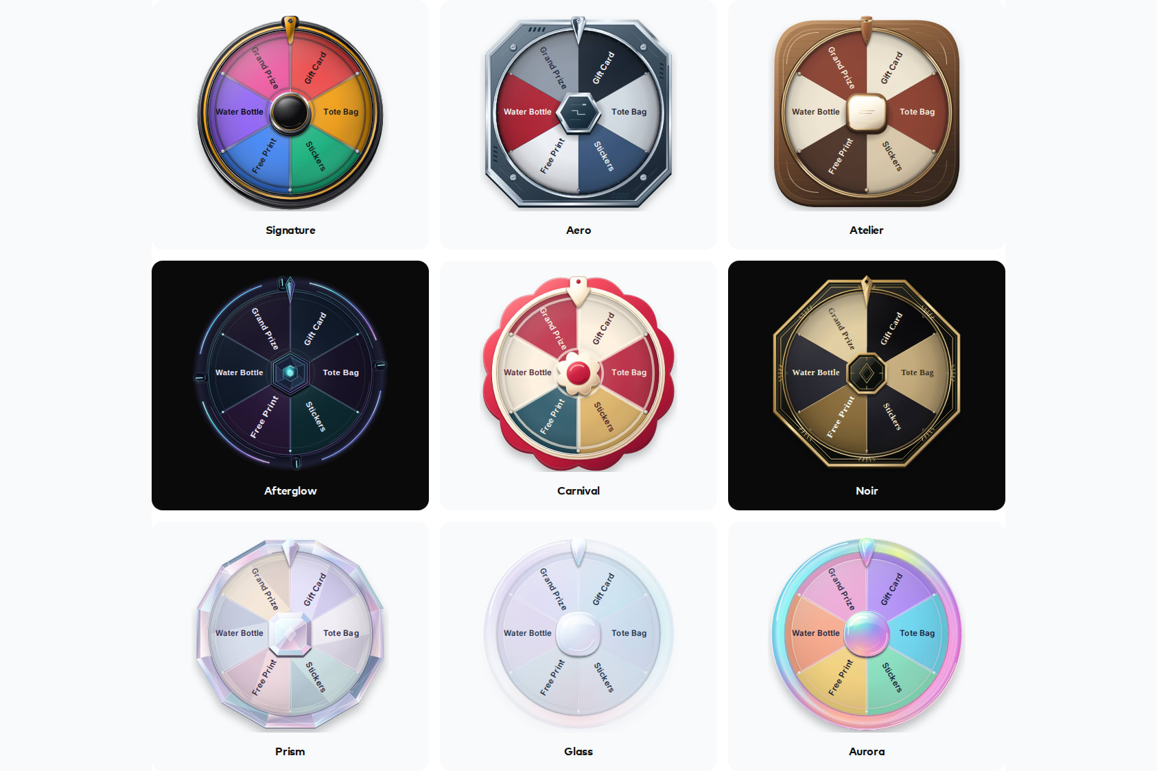
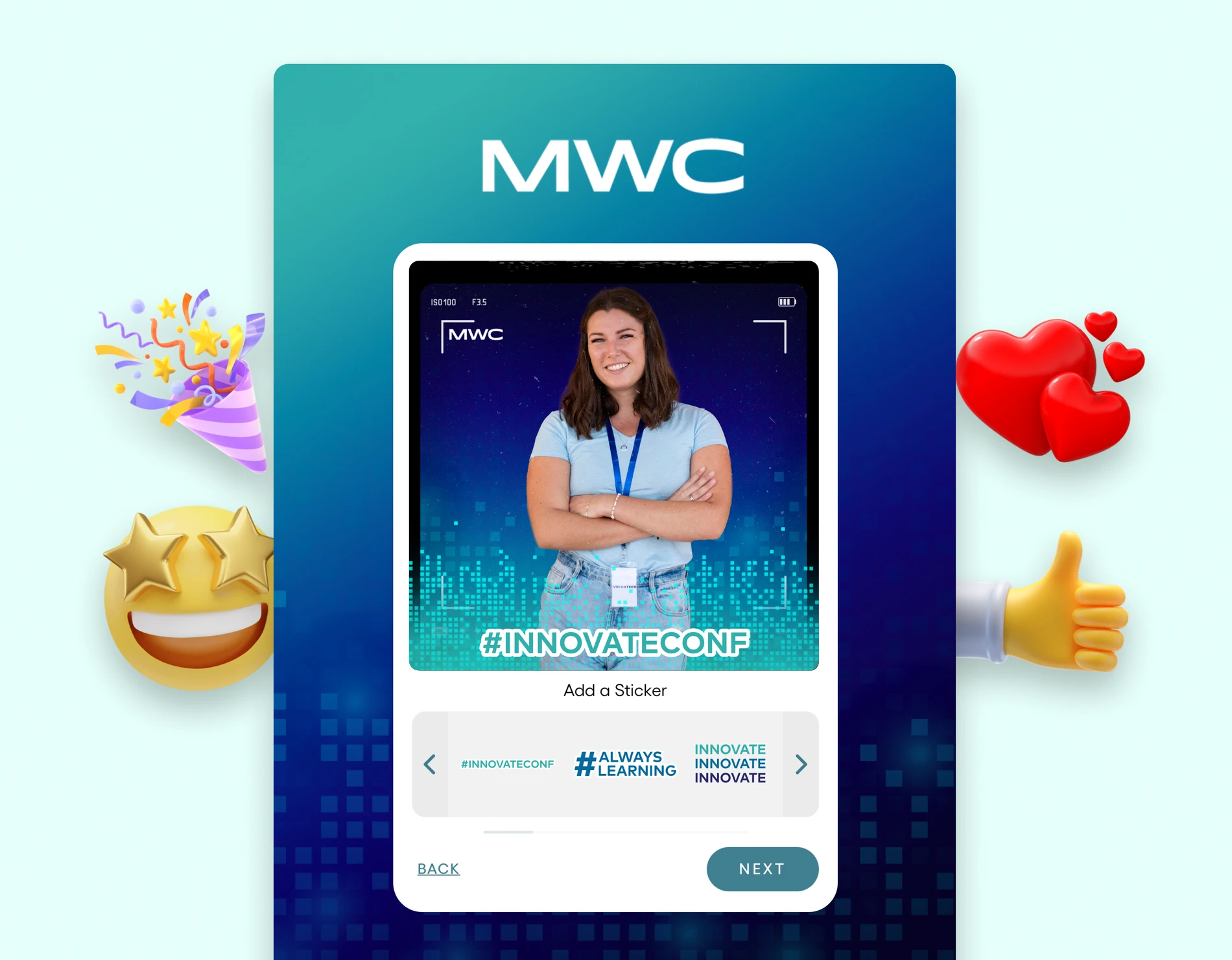
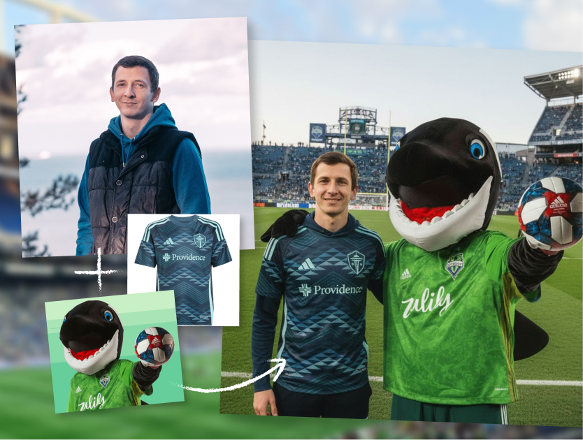
The activation is where events most often start to look like two companies, because it arrives late in the plan from somebody else. On Snapbar, your branding carries across the microsite guests use, the email or text that delivers their content, the gallery they share it from and the live displays, so the activation looks like your event rather than something rented for the afternoon. You choose the hardware and the people running it, and the experience runs on a kiosk, an iPad on a stand, a laptop or guests' own phones, all at once if you want. Here's how it works.
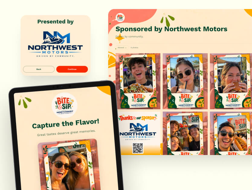
The delivery message is the last thing your brand sends each guest, so don't brief it last. Here's how to treat that email as a brand touchpoint.
How do you check event design before the doors open?
Walk the event as a guest, in order, on a phone. Register. Open the confirmation. Put a photo of the signage next to the activation's start screen. Run one test submission and wait for the delivery to land. Then look for the seam, the moment one surface stops looking like the last one.
Two habits make that check easier to pass. Give every surface one brief and one owner, the activation included. And check the content that leaves the room as carefully as the stage, because it's the piece of your event guests carry home and share. For the wider sequence, see how to design the attendee journey before, during and after the event.
Want your activation to look like the rest of your event?
Get a QuoteOr explore: Live Gallery | Activation Concepts